.gallery-main img,
.gallery-side img {
width: 100%;
height: 100%;
object-fit: cover;
transition: transform 1s cubic-bezier(0.4, 0, 0.2, 1);
filter: brightness(0.9);
}
.gallery-main:hover img,
.gallery-side:hover img {
transform: scale(1.15);
filter: brightness(1);
}
.gallery-tag {
position: absolute;
left: 20px;
top: 20px;
padding: 8px 16px;
border-radius: 999px;
border: 1px solid rgba(110, 231, 183, 0.6);
background: rgba(15, 23, 42, 0.95);
backdrop-filter: blur(20px);
font-size: 11px;
letter-spacing: 0.15em;
text-transform: uppercase;
color: #bbf7d0;
box-shadow: 0 10px 30px rgba(0, 0, 0, 0.6);
}
/* CTA section */
.cta {
margin-bottom: 80px;
}
.cta-card {
border-radius: 40px;
border: 2px solid rgba(110, 231, 183, 0.4);
background: linear-gradient(135deg, rgba(22, 163, 74, 0.3) 0%, rgba(6, 78, 59, 0.4) 50%, rgba(2, 44, 34, 0.5) 100%);
backdrop-filter: blur(20px);
padding: 60px 40px;
box-shadow: 0 40px 100px rgba(0, 0, 0, 0.7), 0 0 80px rgba(34, 197, 94, 0.3), inset 0 0 60px rgba(0, 0, 0, 0.3);
position: relative;
overflow: hidden;
}
.cta-card::before {
content: "";
position: absolute;
top: -50%;
left: -50%;
width: 200%;
height: 200%;
background: radial-gradient(circle, rgba(110, 231, 183, 0.15) 0%, transparent 70%);
animation: rotate 20s linear infinite;
}
@keyframes rotate {
0% {
transform: rotate(0deg);
}
100% {
transform: rotate(360deg);
}
}
.cta-content {
position: relative;
z-index: 1;
text-align: center;
max-width: 700px;
margin: 0 auto;
}
.cta-title {
font-size: clamp(28px, 4vw, 42px);
text-transform: uppercase;
letter-spacing: 0.08em;
margin-bottom: 16px;
background: linear-gradient(135deg, #ecfdf5, #6ee7b7, #a7f3d0);
background-size: 200% 200%;
-webkit-background-clip: text;
-webkit-text-fill-color: transparent;
animation: gradientShift 4s ease infinite;
}
.cta-text {
font-size: 16px;
color: #d1fae5;
line-height: 1.7;
margin-bottom: 32px;
}
.cta-form {
display: grid;
grid-template-columns: 1fr 1fr;
gap: 16px;
max-width: 600px;
margin: 0 auto;
}
@media (max-width: 600px) {
.cta-form {
grid-template-columns: 1fr;
}
}
.field {
display: flex;
flex-direction: column;
gap: 6px;
text-align: left;
}
.field label {
text-transform: uppercase;
letter-spacing: 0.15em;
color: #d1fae5;
font-size: 11px;
font-weight: 600;
}
.field input,
.field textarea {
border-radius: 999px;
border: 2px solid rgba(110, 231, 183, 0.3);
background: rgba(15, 23, 42, 0.9);
backdrop-filter: blur(10px);
padding: 14px 18px;
color: #f9fafb;
font-size: 14px;
outline: none;
transition: all 0.3s ease;
}
.field textarea {
border-radius: 20px;
min-height: 100px;
resize: vertical;
font-family: inherit;
}
.field input::placeholder,
.field textarea::placeholder {
color: #6b7280;
}
.field input:focus,
.field textarea:focus {
border-color: #22c55e;
box-shadow: 0 0 0 4px rgba(34, 197, 94, 0.2), 0 10px 40px rgba(34, 197, 94, 0.3);
background: rgba(15, 23, 42, 0.95);
transform: translateY(-2px);
}
.field-full {
grid-column: 1 / -1;
}
.cta-small-note {
margin-top: 16px;
font-size: 12px;
color: #bbf7d0;
}
/* Footer */
footer {
border-top: 1px solid rgba(52, 211, 153, 0.2);
padding: 40px 24px;
text-align: center;
background: linear-gradient(to bottom, transparent, rgba(6, 78, 59, 0.1));
}
.footer-content {
max-width: 1200px;
margin: 0 auto;
display: flex;
justify-content: space-between;
align-items: center;
flex-wrap: wrap;
gap: 20px;
font-size: 13px;
color: var(--text-muted);
}
@media (max-width: 600px) {
.footer-content {
flex-direction: column;
text-align: center;
}
}
footer span.brand {
color: #6ee7b7;
text-transform: uppercase;
letter-spacing: 0.15em;
font-size: 12px;
font-weight: 600;
}
.footer-links {
display: flex;
gap: 24px;
}
.footer-links a {
color: #9ca3af;
transition: color 0.3s ease;
}
.footer-links a:hover {
color: #6ee7b7;
}
/* Scroll reveal animations */
.reveal {
opacity: 0;
transform: translateY(30px);
transition: all 0.8s cubic-bezier(0.4, 0, 0.2, 1);
}
.reveal.visible {
opacity: 1;
transform: translateY(0);
}
.reveal-left {
opacity: 0;
transform: translateX(-50px);
transition: all 0.8s cubic-bezier(0.4, 0, 0.2, 1);
}
.reveal-left.visible {
opacity: 1;
transform: translateX(0);
}
.reveal-right {
opacity: 0;
transform: translateX(50px);
transition: all 0.8s cubic-bezier(0.4, 0, 0.2, 1);
}
.reveal-right.visible {
opacity: 1;
transform: translateX(0);
}
.reveal-scale {
opacity: 0;
transform: scale(0.8);
transition: all 0.8s cubic-bezier(0.4, 0, 0.2, 1);
}
.reveal-scale.visible {
opacity: 1;
transform: scale(1);
}
/* About grid */
.about-grid {
display: grid;
grid-template-columns: 1.2fr 1fr;
gap: 32px;
margin-top: 40px;
}
@media (max-width: 900px) {
.about-grid {
grid-template-columns: 1fr;
}
}
.features-grid {
display: grid;
grid-template-columns: repeat(2, 1fr);
gap: 16px;
margin-top: 20px;
}
@media (max-width: 600px) {
.features-grid {
grid-template-columns: 1fr;
}
}
.feature-item {
padding: 16px 20px;
border-radius: 20px;
border: 1px solid rgba(52, 211, 153, 0.2);
background: rgba(15, 23, 42, 0.6);
backdrop-filter: blur(10px);
transition: all 0.3s ease;
}
.feature-item:hover {
transform: translateY(-4px);
border-color: rgba(52, 211, 153, 0.5);
box-shadow: 0 10px 40px rgba(34, 197, 94, 0.2);
}
.feature-label {
font-size: 11px;
text-transform: uppercase;
letter-spacing: 0.15em;
color: #6b7280;
margin-bottom: 6px;
}
.feature-value {
color: #6ee7b7;
font-weight: 600;
font-size: 15px;
}
/* Plan section */
.plan-grid {
display: grid;
grid-template-columns: 1.2fr 1fr;
gap: 40px;
align-items: center;
margin-top: 40px;
}
@media (max-width: 900px) {
.plan-grid {
grid-template-columns: 1fr;
}
}
.plan-image {
border-radius: 28px;
border: 1px solid rgba(52, 211, 153, 0.3);
background: linear-gradient(135deg, #064e3b, #022c22);
padding: 16px;
box-shadow: 0 30px 80px rgba(0, 0, 0, 0.6);
transition: all 0.5s ease;
}
.plan-image:hover {
transform: scale(1.02) rotate(-1deg);
box-shadow: 0 40px 100px rgba(0, 0, 0, 0.8), 0 0 60px rgba(34, 197, 94, 0.4);
}
.plan-image img {
border-radius: 20px;
width: 100%;
display: block;
}
.plan-details {
font-size: 15px;
color: #d1d5db;
line-height: 1.8;
}
.plan-specs {
display: grid;
grid-template-columns: repeat(2, 1fr);
gap: 16px;
margin-top: 24px;
}
@media (max-width: 600px) {
.plan-specs {
grid-template-columns: 1fr;
}
}
.plan-spec {
border-radius: 20px;
border: 1px solid rgba(52, 211, 153, 0.3);
background: rgba(15, 23, 42, 0.7);
backdrop-filter: blur(10px);
padding: 16px 20px;
transition: all 0.3s ease;
}
.plan-spec:hover {
transform: translateY(-4px);
border-color: rgba(52, 211, 153, 0.6);
box-shadow: 0 10px 30px rgba(34, 197, 94, 0.2);
}
.plan-spec strong {
color: #6ee7b7;
display: block;
font-size: 13px;
margin-bottom: 4px;
text-transform: uppercase;
letter-spacing: 0.1em;
}
.plan-spec span {
color: #9ca3af;
font-size: 14px;
}
/* For Who Section */
.for-who-grid {
display: grid;
grid-template-columns: repeat(auto-fit, minmax(280px, 1fr));
gap: 24px;
margin-top: 40px;
}
.for-who-card {
border-radius: 28px;
border: 1px solid rgba(52, 211, 153, 0.2);
background: linear-gradient(135deg, rgba(30, 41, 59, 0.6), rgba(15, 23, 42, 0.8));
backdrop-filter: blur(20px);
padding: 32px 28px;
text-align: center;
transition: all 0.5s cubic-bezier(0.4, 0, 0.2, 1);
position: relative;
overflow: hidden;
}
.for-who-card::before {
content: "";
position: absolute;
top: 0;
left: -100%;
width: 100%;
height: 100%;
background: linear-gradient(90deg, transparent, rgba(110, 231, 183, 0.1), transparent);
transition: left 0.6s ease;
}
.for-who-card:hover::before {
left: 100%;
}
.for-who-card:hover {
transform: translateY(-10px) scale(1.02);
border-color: rgba(52, 211, 153, 0.5);
box-shadow: 0 30px 80px rgba(0, 0, 0, 0.7), 0 0 60px rgba(34, 197, 94, 0.3);
}
.for-who-icon {
font-size: 48px;
margin-bottom: 16px;
display: inline-block;
transition: transform 0.5s ease;
}
.for-who-card:hover .for-who-icon {
transform: scale(1.2) rotate(5deg);
}
.for-who-card h3 {
font-size: 20px;
color: #6ee7b7;
margin-bottom: 12px;
letter-spacing: 0.05em;
text-transform: uppercase;
}
.for-who-card p {
font-size: 14px;
color: #d1d5db;
line-height: 1.6;
}
/* Pricing Section */
.pricing-grid {
display: grid;
grid-template-columns: repeat(auto-fit, minmax(320px, 1fr));
gap: 32px;
margin-top: 40px;
align-items: start;
}
@media (max-width: 1024px) {
.pricing-grid {
grid-template-columns: 1fr;
max-width: 500px;
margin-left: auto;
margin-right: auto;
}
}
.pricing-card {
border-radius: 32px;
border: 2px solid rgba(52, 211, 153, 0.2);
background: linear-gradient(135deg, rgba(30, 41, 59, 0.6), rgba(15, 23, 42, 0.9));
backdrop-filter: blur(20px);
padding: 40px 32px;
transition: all 0.5s cubic-bezier(0.4, 0, 0.2, 1);
position: relative;
overflow: hidden;
}
.pricing-card::before {
content: "";
position: absolute;
inset: -2px;
background: linear-gradient(135deg, transparent, rgba(110, 231, 183, 0.3), transparent);
border-radius: 32px;
z-index: -1;
opacity: 0;
transition: opacity 0.5s ease;
}
.pricing-card:hover {
transform: translateY(-12px);
border-color: rgba(52, 211, 153, 0.5);
box-shadow: 0 40px 100px rgba(0, 0, 0, 0.8), 0 0 80px rgba(34, 197, 94, 0.3);
}
.pricing-card:hover::before {
opacity: 1;
}
.pricing-card-featured {
border-color: rgba(34, 197, 94, 0.6);
background: linear-gradient(135deg, rgba(22, 163, 74, 0.2), rgba(30, 41, 59, 0.7), rgba(15, 23, 42, 0.9));
box-shadow: 0 30px 80px rgba(34, 197, 94, 0.3);
transform: scale(1.05);
}
.pricing-card-featured:hover {
transform: translateY(-12px) scale(1.05);
box-shadow: 0 50px 120px rgba(34, 197, 94, 0.5);
}
.pricing-badge {
display: inline-block;
padding: 6px 14px;
border-radius: 999px;
background: rgba(15, 23, 42, 0.9);
border: 1px solid rgba(52, 211, 153, 0.4);
font-size: 11px;
letter-spacing: 0.15em;
text-transform: uppercase;
color: #bbf7d0;
margin-bottom: 20px;
}
.pricing-badge-featured {
background: linear-gradient(135deg, rgba(34, 197, 94, 0.3), rgba(22, 163, 74, 0.4));
border-color: rgba(110, 231, 183, 0.6);
color: #ecfdf5;
font-weight: 600;
box-shadow: 0 0 20px rgba(34, 197, 94, 0.4);
animation: pulse 2s ease-in-out infinite;
}
.pricing-title {
font-size: 28px;
color: #ecfdf5;
margin-bottom: 16px;
letter-spacing: 0.08em;
text-transform: uppercase;
background: linear-gradient(135deg, #ecfdf5, #6ee7b7);
-webkit-background-clip: text;
-webkit-text-fill-color: transparent;
}
.pricing-price {
display: flex;
align-items: baseline;
justify-content: center;
margin-bottom: 16px;
gap: 4px;
}
.price-currency {
font-size: 24px;
color: #6ee7b7;
font-weight: 600;
}
.price-amount {
font-size: 56px;
font-weight: 700;
color: #ecfdf5;
line-height: 1;
background: linear-gradient(135deg, #6ee7b7, #10b981);
-webkit-background-clip: text;
-webkit-text-fill-color: transparent;
}
.price-period {
font-size: 16px;
color: #9ca3af;
align-self: flex-end;
margin-bottom: 8px;
}
.pricing-description {
font-size: 14px;
color: #d1d5db;
margin-bottom: 28px;
line-height: 1.6;
min-height: 42px;
}
.pricing-features {
list-style: none;
padding: 0;
margin-bottom: 32px;
text-align: left;
}
.pricing-features li {
padding: 12px 0;
font-size: 14px;
color: #d1d5db;
display: flex;
align-items: center;
gap: 12px;
border-bottom: 1px solid rgba(52, 211, 153, 0.1);
transition: all 0.3s ease;
}
.pricing-features li:hover {
padding-left: 8px;
color: #ecfdf5;
}
.pricing-features li:last-child {
border-bottom: none;
}
.pricing-features li.disabled {
opacity: 0.4;
}
.pricing-features .check {
width: 24px;
height: 24px;
border-radius: 50%;
background: linear-gradient(135deg, #22c55e, #16a34a);
display: flex;
align-items: center;
justify-content: center;
color: #ecfdf5;
font-weight: 700;
flex-shrink: 0;
box-shadow: 0 0 20px rgba(34, 197, 94, 0.4);
}
.pricing-features .cross {
width: 24px;
height: 24px;
border-radius: 50%;
background: rgba(75, 85, 99, 0.3);
display: flex;
align-items: center;
justify-content: center;
color: #6b7280;
font-weight: 700;
flex-shrink: 0;
}
.pricing-btn {
width: 100%;
justify-content: center;
padding: 16px 32px;
font-size: 14px;
font-weight: 600;
}
.pricing-note {
margin-top: 40px;
text-align: center;
padding: 24px;
border-radius: 20px;
background: linear-gradient(135deg, rgba(34, 197, 94, 0.15), rgba(6, 78, 59, 0.2));
border: 1px solid rgba(52, 211, 153, 0.3);
backdrop-filter: blur(10px);
}
.pricing-note p {
font-size: 15px;
color: #d1fae5;
margin: 0;
}
.pricing-note strong {
color: #6ee7b7;
font-size: 17px;
}
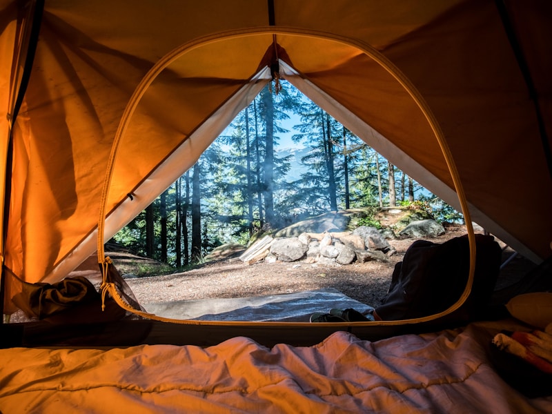
Твій власний Sleep Pod серед природи
Sleep Pod — це інноваційний модульний будинок для життя на природі. Купи свій власний Pod та насолоджуйся комфортом у будь-якому куточку світу. Повна автономність, сучасний дизайн та швидке встановлення.
14 днів встановлення
100% автономність
30 років гарантія
Розрахувати вартість
Акція: Замовте до кінця місяця та отримайте безкоштовне встановлення + сонячні панелі в подарунок
Чому Sleep Pod?
Ми створили модульний будинок, який можна встановити у будь-якому місці без фундаменту та складних дозволів. Повна автономність, екологічність та швидке введення в експлуатацію.
Встановлення
Без фундаменту
Мобільність
Можна переміщувати
Автономність
100% незалежний
Що входить у комплект?
Все необхідне для комфортного життя "під ключ":
????️ Модульна конструкція зі сталі та скла ???? Електрична система + інвертор ???? Система водопостачання ????️ Опалення та кондиціонування ???? Енергоефективні вікна ???? Доставка та встановлення ????
Заміський будинок Ідеальна альтернатива дачі. Швидке будівництво без фундаменту, всі комунікації включені.
????
Бізнес-простір Офіс на природі, гостьовий будинок для готелю, або унікальний Airbnb з високою рентабельністю.
????
Інвестиція Мобільна нерухомість, яку можна переміщувати. Висока ліквідність та швидка окупність.
????
Еко-життя Повна автономність від міських комунікацій. Сонячна енергія, система збору води.
????️
Глемпінг бізнес Готове рішення для туристичного бізнесу. Швидкий запуск, мінімальні інвестиції.
????
Постійне житло Повноцінний будинок для життя цілий рік. Всесезонна ізоляція, опалення та охолодження.
Економ
Base $ 45,000
Компактне та функціональне рішення для початку еко-життя
✓ Площа 25 м²✓ Панорамні вікна 180°✓ Базова ізоляція✓ Міні-кухня + санвузол✓ Базове електрообладнання✓ Підключення до комунікацій✗ Сонячні панелі✗ Тераса✗ Smart Home Замовити Base Встановлення: 10-14 днів
Хіт продажів
Standard $ 72,000
Оптимальний баланс комфорту, автономності та вартості
✓ Площа 35 м²✓ Панорамні вікна 270°✓ Покращена ізоляція✓ Повна кухня + душова✓ Сонячні панелі 5 кВт✓ Система збору дощової води✓ Тераса 10 м²✓ Автономне опалення✓ Базовий Smart Home Замовити Standard Встановлення: 14-18 днів
Преміум
Premium $ 115,000
Максимальний комфорт та повна автономність. Готовий дім майбутнього
✓ Площа 50 м²✓ Панорамні вікна 360°✓ Преміум ізоляція✓ Дизайнерська кухня + Spa-ванна✓ Сонячні панелі 10 кВт + акумулятори✓ Автономна система води✓ Тераса 20 м² з jacuzzi✓ Повний Smart Home✓ Камін / піч✓ Індивідуальний дизайн✓ Розширена гарантія 5 років Замовити Premium Встановлення: 20-25 днів
???? Спеціальна пропозиція до кінця місяця: Безкоштовне встановлення + сонячні панелі в подарунок для Base комплектації
???? Доступна розстрочка на 24 місяці без переплат
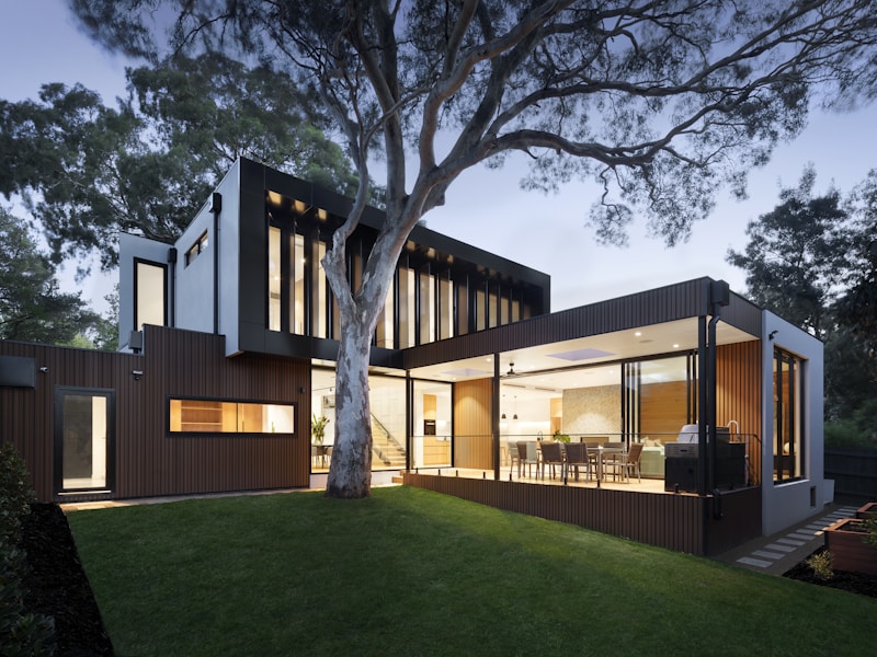
Зовнішній вигляд
Нічна атмосфера
Sleep Pod спроектований для встановлення на будь-якій поверхні без потреби в фундаменті. Модульна конструкція дозволяє транспортувати та встановлювати Pod у найвіддаленіших місцях.
Площа 35 м²
Висота 3.2 м
Вікна 270° огляд
Матеріали Еко-дерево + скло
Енергія Сонячні панелі
Вода Система фільтрації